
Posted By
Posted On
Realistic 3D house renders are a powerful storytelling tool. When executed properly they help clients grasp your vision and bring design concepts to life long before construction begins. Done poorly they shatter trust, confuse viewers and misrepresent the project. Over the years, recurring missteps have kept otherwise promising renders from achieving their potential. These architectural rendering mistakes are avoidable with careful planning. The following guide exposes those pitfalls and offers actionable advice on how to make 3D rendering more realistic.
The Promise and Danger of 3D Rendering
Architectural visualization has never been more accessible. With intuitive software and abundant asset libraries, it is tempting to assume good results will come out of the box. But rendering is still a craft. Industry specialists point out that poor lighting quickly makes an image look fake, while unrealistic or low‑quality materials can ruin believability. Understanding the fundamentals allows architects to harness technology rather than be undermined by it.
Mistake 1: Treating Lighting as an Afterthought
Lighting is arguably the most important ingredient in a 3D scene. Without careful attention to how light behaves, even the most detailed model appears flat. Poor lighting is one of the most frequent 3D rendering lighting mistakes. Guides on rendering note that too much brightness washes out detail and too little leaves the image dull. Another source explains that a lack of light bounces or incorrect shadow models makes surfaces sterile.
How to Get It Right
Use realistic lighting models in your software by turning on global illumination and allowing enough bounces so light scatters naturally. Balance natural and artificial sources; matching the sun’s angle and temperature to the time of day prevents unnatural shadows. Testing different times, such as golden hour versus midday, can dramatically change mood. Finally, confirm that shadows and reflections correspond with your light sources.
Mistake 2: Using Unrealistic Materials and Textures
Nothing breaks immersion faster than shiny plastic “wood” or brick patterns that repeat like wallpaper. Articles on common 3D rendering mistakes warn that low‑resolution or overly reflective materials make images look fake. Repeating textures and ignoring bump mapping are tell‑tale signs of computer‑generated scenes.
How to Get It Right
Select high‑resolution textures that match the real materials specified and map them correctly so they scale naturally. Add bump, normal or displacement maps for depth and subtle imperfections. Introduce variation by randomizing texture placement and include controlled imperfections like scratches or dirt. The goal is a surface that looks touched by life rather than freshly plastic‑wrapped.
Mistake 3: Inaccurate Scale and Proportions
Viewers intuitively sense when elements are out of proportion; a door that’s too tall or furniture that’s too small immediately feels off. Large articles stress that incorrect scaling is one of the most common errors in architectural rendering.
How to Get It Right
Model everything at true scale from the start using drawings or BIM data. Insert a human figure into your scene to check proportions. Cross‑reference furniture sizes with manufacturer data or photos so they feel right. Consistent units across files prevent measurement mismatches, and a reference person acts as a reality check.
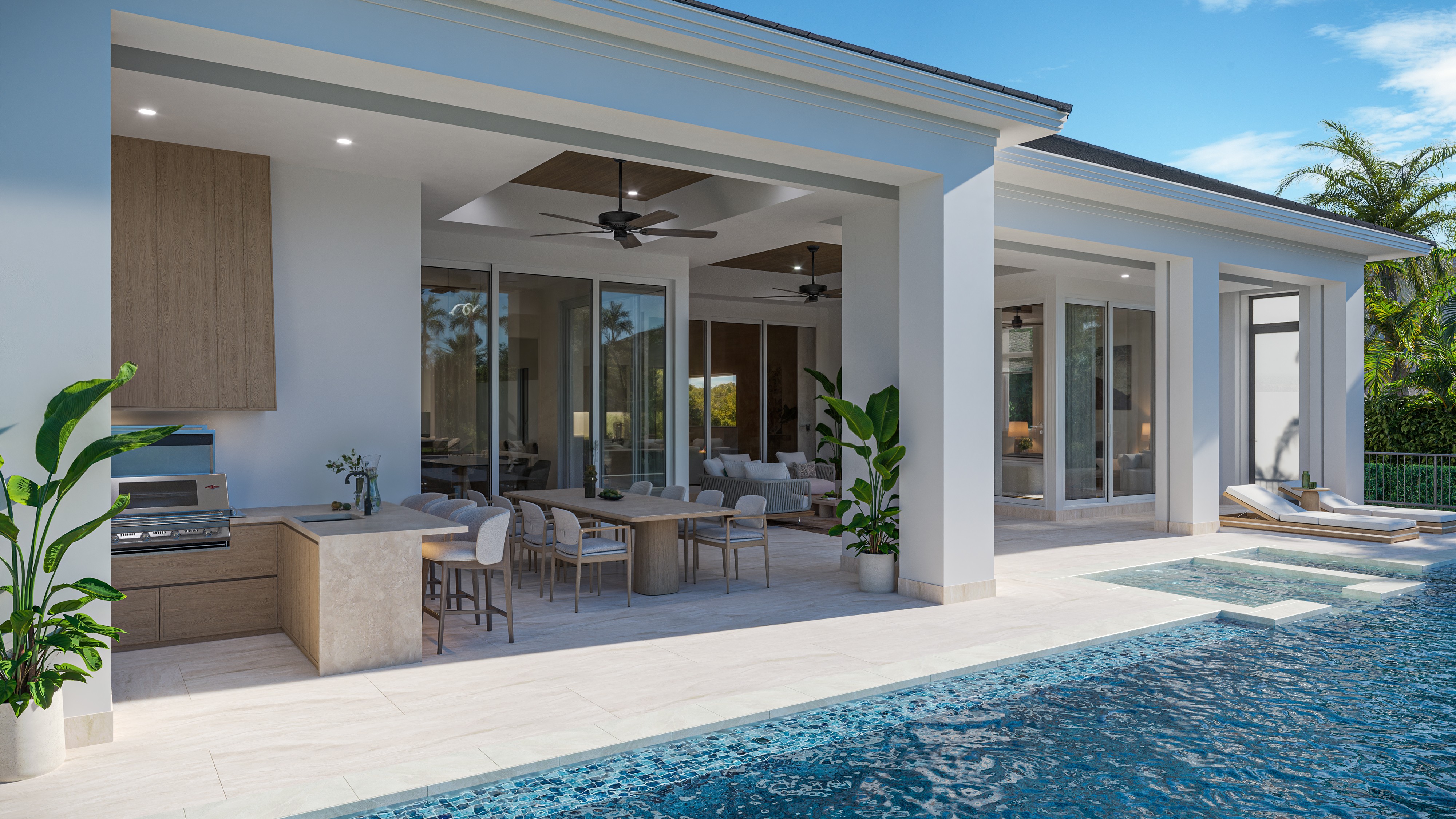
Mistake 4: Omitting Context and Environmental Detail
A building floating on a blank horizon is a dead giveaway of an amateur render. Experts warn that missing context confuses viewers; environmental cues help people understand scale and placement. Rendering in isolation makes the design look out of place.
How to Get It Right
Include simple massing models for neighboring buildings, roads and topography to show how the project sits within its surroundings. Add site elements like streetlights, benches and vegetation; for interiors incorporate rugs, books and electrical outlets. Thoughtful environmental details ground the design in reality and tell a story about how people will use the space.
Mistake 5: Selecting Poor Camera Angles
A great model can be undermined by a terrible point of view. Guides advise against awkward corners, distorted wide angles or overly high camera positions; angles should showcase key features and follow compositional rules.
How to Get It Right
Place your virtual camera at human eye level (around 1.6 meters) for most interior scenes and choose either ground level or bird’s‑eye view for exteriors, avoiding the uncomfortable mid‑air perspective. Stick to focal lengths between 35 and 50 mm unless you’re in a tight space. Use the rule of thirds and leading lines to guide the viewer’s eye. A carefully chosen camera angle can elevate the mood and clarity of your render.
Mistake 6: Over‑Editing and Excessive Effects
Post‑production can polish a render, but heavy handed tweaks often backfire. Over‑saturated colors, exaggerated contrasts and gimmicky lens flares distract from the design. An article warns that too much editing creates a cartoony look and hides your architecture.
How to Get It Right
Enhance subtly by adjusting brightness and contrast just enough to mimic real photography. Keep colors within believable ranges. Use lens effects sparingly; a gentle depth of field can draw focus but avoid extreme blur. When unsure, compare your render to photos of similar scenes. If your image looks surreal, reduce the post‑processing until it feels grounded.
Mistake 7: Reusing Stock People and Props
Populating a scene with humans and furniture helps convey scale, but reusing the same stock characters or misplacing them can be distracting. The “woman in beige” has become infamous because she appears in countless renders. Oversized or robotic entourage items betray an artificial scene.
How to Get It Right
Curate a diverse library of human figures in different poses and attire. Scale them correctly and ensure they cast natural shadows and reflections. Vary their activities, such as reading, walking or conversing, to suggest how people will inhabit the space. This small investment adds authenticity and avoids the perception that you’re recycling assets across projects.
Mistake 8: Cluttered or Sterile Scenes
There’s a fine line between a richly detailed image and an overcrowded one. Conversely, a sterile room with no signs of life can feel soulless. Bare images without everyday objects feel empty, while overly complex scenes distract from the architecture.
How to Get It Right
Highlight the key architectural features and remove unnecessary background clutter. Introduce believable life through small touches like books, cups or a slightly rumpled throw. Use layers within your software to manage complexity and hide objects during iteration. Aim for lived‑in realism without overwhelming the viewer.
Mistake 9: Mishandled Reflections
Reflective surfaces are notoriously challenging. Articles note that reflections are difficult to master and often overlooked. Time‑of‑day mismatches, such as a sunset sky mirrored by midday reflections, instantly break immersion.
How to Get It Right
Model enough surrounding environment so reflective surfaces have something realistic to mirror. Use high dynamic range (HDRI) images for distant reflections. Match the lighting and sky environment so reflections correspond to the time depicted. Adjust material properties for proper roughness and gloss; glass often has a slight tint and metal should include subtle scratches.
Mistake 10: Technical Errors
A beautiful render is still useless if it ignores basic architectural accuracy. Incorrect dimensions or impossible lighting scenarios undermine credibility.
How to Get It Right
Verify your model against construction documents. Use realistic camera heights and lenses to avoid distorted rooms. Collaborate with engineers and consultants so structure and systems are depicted correctly. An accurate model ensures your render sells the real project, not a fantasy.
Practical Tips to Make 3D House Rendering More Realistic
Below are architectural visualization tips for architects, proactive steps you can take to elevate your skills:
Study real photography: Analyze how light hits materials, observe shadows and imperfections and try to replicate those qualities in your renders.
Master your rendering tool: Whether you use V‑Ray, Enscape or another engine, learn how to adjust exposure, white balance and physical sky settings to produce natural results.
Invest in a quality asset library: High‑resolution textures, accurate 3D furniture and varied vegetation models save time and create consistency.
Iterate and review: Share drafts with colleagues, gather feedback and refine your work. Small adjustments can make a big difference.
Tell a story: Use light, composition and props to evoke the way people will live in the space, such as morning sun streaming through a kitchen window or evening lights on a patio.
Closing Thoughts
Avoiding common 3D rendering mistakes is less about perfection and more about honesty and clarity. By focusing on lighting, materials, scale, context, composition and technical accuracy, architects can transform sterile digital models into images that resonate. Clients may not articulate why a render feels off; they simply react. With the 3D house rendering tips outlined here, your images will not only avoid the pitfalls but also communicate vision and atmosphere. Through practice and attention to detail, you’ll move from asking why 3D house renders look unrealistic to creating visuals that inspire confidence and excitement in every project.
Want renders that avoid these mistakes? Explore our architectural rendering services.
 >
>